 Published on Aug 08, 2025 by Arcadia Science
 G–P Atlas: A neural network framework for mapping genotypes to many phenotypes
Contributors (A-Z)
G–P Atlas: A neural network framework for mapping genotypes to many phenotypes
Purpose
Genotype–phenotype relationships are central to our understanding of inheritance, disease mechanisms, and evolutionary processes. Despite this, the most commonly applied methods for genotype–phenotype mapping have changed little in the last 100 years, typically examining one phenotype and genotype at a time. We present G–P Atlas, an innovative neural network framework that transforms genetic analysis by simultaneously modeling multiple phenotypes and capturing complex nonlinear relationships between genes. Our two-tiered denoising autoencoder approach first learns a low-dimensional representation of phenotypes and then maps genetic data to these representations, leading to a data-efficient training process.
We find that G–P Atlas predicts many phenotypes simultaneously from genetic data and successfully identifies causal genes — including those acting through non-additive interactions that conventional approaches may miss. Thus, by modeling organisms holistically rather than as collections of isolated traits, G–P Atlas enables accurate phenotype prediction while revealing previously unappreciated genetic drivers of biological variation.
This framework should interest researchers in quantitative genetics, evolutionary biology, precision medicine, and computational biology who rely on accurate genotype–phenotype models. We welcome feedback on potential applications and extensions of G–P Atlas as we work toward comprehensive models that capture the true complexity of living systems and their genetic underpinnings.
- Data and all associated code from this pub are available in this GitHub repo.
Share your thoughts!
Feel free to provide feedback by commenting in the box at the bottom of this page or by posting about this work on social media. Please make all feedback public so other readers can benefit from the discussion.
Background and goals
Decoding inheritance, disease, and evolution (as well as engineering biological systems) relies on decoding the relationships between genes and phenotypes. However, methods for mapping genotype–phenotype relationships have barely changed over the last 100 years. Though biological systems are defined by complex, often nonlinear interactions between genes, phenotypes, and environments ([1]; for review, see [2] and [3]), most approaches focus on phenotypes in isolation and assume linear, additive interactions between genes (see [4] and [5]; for review, see [6] and [7]). As a result, even in the best cases, a substantial portion of biological phenomena may be missed. In the worst cases, models may point us in completely wrong directions.
The focus on individual genes likely results from computational complexity — allowing interactions between all genes using current modeling methods would often require data from more humans than exist. And at the population level, gene–gene interactions drive only a small fraction of phenotypic variation ([8] and [9]; for review, see [10]). However, we're most often concerned with predicting the phenotypes of an individual (not a population) where gene–gene interactions may have dramatic impacts.
Like genotypes, most studies consider phenotypes individually. But many phenotypes share a generative process structured by genetics (e.g., pleiotropy or a single gene impacting multiple phenotypes), physics (e.g., cellular surface-area-to-volume ratio), or evolution [2][11][12][13]. Such mechanisms drive complex phenotype–phenotype relationships [2]. We’ve previously shown that these relationships can be leveraged to better predict phenotypes [2][14][15][16].
Machine learning models offer promising opportunities for capturing gene–gene interactions and modeling many phenotypes that are computationally tractable [17]. Recent approaches include the following:
- Random forest methods demonstrate valuable capabilities for modeling epistatic effects through their intrinsic architecture and provide interpretable feature importance metrics [18]
- Specialized approaches like multifactor dimensionality reduction designed for detecting gene–gene interactions have opened new avenues for exploring genetic architecture [19]
- Kernel methods can model complex genetic effects on arbitrarily structured phenotypes [20]
- Multi-task learning frameworks have advanced our ability to model traits jointly, recognizing their biological interconnectedness [21]
- Variational autoencoders offer powerful approaches for learning compressed genetic representations that can reveal underlying population structure [22]
Despite these advances, a framework that efficiently captures gene–gene interactions, simultaneously modeling many phenotypes and retains interpretability to allow the identification of genes influencing phenotypes remains elusive.
One ongoing problem with the application of machine learning to the modeling of biological systems is data scarcity. Collecting biological data is expensive; almost all biological studies are data-limited. Furthermore, while many machine-learning approaches (including artificial neural network-based methods) can learn higher-order complex relationships between parameters, achieving this requires comparatively large amounts of data. In several applications to biological data, machine learning models not designed to be data-efficient failed to learn higher-order (nonlinear) relationships, though such relationships were present [23][24][16]. This was true even for models using modern architectures specifically designed to capture higher-order relationships (e.g., attention), which have been effective in other data containing such complex interactions (e.g., written language) [25]. The application of machine learning to biological questions will require data-efficient architectures.
We sought to create a modeling framework that achieved four goals:
- Simultaneously modeling multiple phenotypes and genotypes (and potentially environments) to achieve a more holistic model for an organism.
- Capturing nonlinear relationships among genotypes, phenotypes, and environments.
- Sufficient data efficiency to accommodate real-world biological research constraints.
- A capacity for inference (e.g., identifying causal genotypes and predicting phenotypes).
Here, we demonstrate G–P Atlas, a modeling framework that addresses many of these needs and might serve as a replacement for many current genetic methods.
Access all our data, including simulated and empirical phenotypes and genotypes, in this GitHub repo (DOI: 10.5281/zenodo.16782901).
The approach
To see how the G–P Atlas performs, skip straight to “The results.”
Architecture
We adopted a denoising autoencoder framework to capture phenotype–phenotype relationships and allow for gene–gene and gene–environment interactions. Autoencoders consist of multiple neuronal layers comprising an encoder that aims to create a compressed, efficient data encoding by passing that data through an information bottleneck and a decoder capable of taking this reduced (latent) data representation and accurately reproducing the original input data [26]. They can be robust to missing and corrupted data (denoising, [27]), enable dimensionality reduction [28], and can capture nonlinear relationships among parameters [29]. They've been the subject of extensive research, and many differing architectures perform differently well across various tasks [26][30][31][32].
Denoising autoencoders (trained for accuracy despite deliberately corrupted input data) are particularly attractive for modeling biological data because they're robust to measurement noise and missing data and can capture complex relationships among parameters even with minimal data [27]. While conventional autoencoders can learn simple embeddings (such as the identity function), they're unlikely to capture the full complexity of relationships among genotypes and phenotypes. Denoising models learn more general manifolds that are more likely to capture the actual constraints (e.g., genetic and evolutionary) that structure biological systems. For a more expanded discussion of these points, see the Mathematical framework and theoretical foundations section.
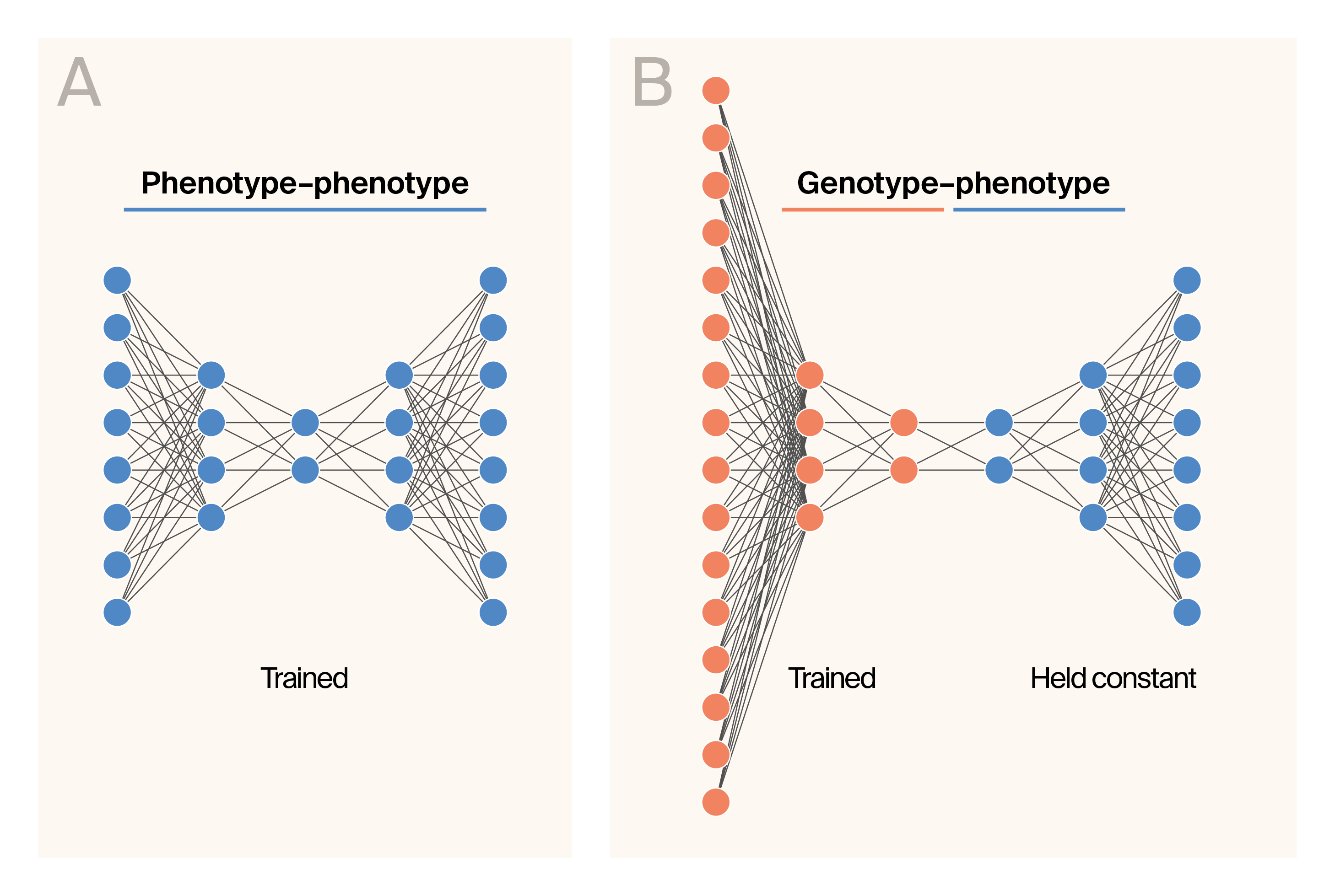
Schematic representation of the G–P Atlas architecture.
(A) Schematic representation of the phenotype–phenotype autoencoder.
(B) Schematic representation of the genotype–phenotype training phase.
The color indicates layers trained with phenotypic data (blue) or genetic data (orange).
G–P Atlas has a two-tiered architecture and training procedure. We first trained a phenotype–phenotype denoising autoencoder (Figure 1, A). Then, we conducted a second round of training to map genotype data into the learned latent space of the phenotype decoder (Figure 1, B) such that genetic data predict phenotypes. During this round of training, we held the weights of the phenotype decoder (Figure 1, B; blue) constant, minimizing the number of parameters trained during this “mapping” procedure. We supplemented the phenotype data with Gaussian-distributed noise and genotype data with missing and erroneous genotypes during training.
Each encoder and decoder contains three layers. All input and internal layers had leaky rectified linear (leaky ReLU, negative slope of 0.01) activation functions [33] and were batch-normalized [34] with a momentum of 0.8. The output layer for all networks producing phenotypes had a linear activation function. We instantiated all networks using PyTorch (v2.2.2, RRID: SCR_018536 [35]).
Training procedure
We adopted the following training procedure:
- Train a denoising phenotype–phenotype autoencoder where a model predicts uncorrupted phenotypic data from corrupted phenotypic data. The learned latent representation is an information-rich encoding of those phenotypes with fewer dimensions than the initial data.
- To create genotype-to-phenotype mappings, we conducted a second round of training with paired (for each individual) genetic and phenotypic data. We made a new network that maps genotypic data into the latent space from the phenotype decoder. We fixed the parameter weights of the previously trained phenotypic decoder. We then trained the model to predict the uncorrupted phenotypic data based on corrupted genotypic data.
For each dataset, we tuned the following hyperparameters: the size of the latent space, the size of the hidden layers, and the amount of added noise using grid search. To tune each hyperparameter, we trained the networks using 80% of the data (the training set) and tested prediction accuracy using the remaining 20% (the test set). We used a batch size of 16 and 250 epochs for all training. After 250 epochs of training, we evaluated the model. We performed gradient descent using the Adam optimizer [36] with momentum decay parameters of 0.5 (β₁) and 0.999 (β2), no weight decay, and a learning rate of 0.001. For genotype-to-phenotype training, we regularized the weights mapping genotypes to the phenotype latent space: L1 norm (weight of 0.8) and L2 norm (weight of 0.01). As all phenotypes modeled here were quantitative, we used the mean squared error loss function to train any network that outputs phenotype predictions. All reported statistics are for the 20% test dataset.
Variable importance
To estimate the importance of any particular parameter (a specific phenotype or genotype at a specific location) for predicting phenotypes or genotypes, we used permutation-based feature ablation as implemented in Captum [37]. Briefly, the importance of each feature is measured as the mean shift in the predicted phenotype distribution when we omit that feature. This measure is determined independently for each allelic state. For each allele, the reported statistic is the mean squared variable importance. To identify loci (where there may be more than one allelic state) contributing to phenotypic variation, we used the largest variable importance from the set of alleles at that locus. The variable importance was calculated using the 20% test dataset.
Datasets
We evaluated this approach using two datasets: one simulated dataset that we have used previously [38] and an extensively studied genotype–phenotype dataset that resulted from an F1 cross between two budding yeast (Saccharomyces cerevisiae) strains [39]. An extensive description of the simulated dataset is available in [38]. Briefly, we simulated genotypes for 600 individuals at 3,000 loci. For each of the 30 phenotypes, 10 loci contribute additively to phenotypic variation. We gave each causal locus a 20% probability of influencing each other phenotype (pleiotropy) and a 20% probability of interacting with each other contributing locus (epistasis or gene–gene interactions). All gene–gene interactions were multiplicative. An extensive description of the yeast dataset is available in [39]. Briefly, the strains are haploids that result from a cross between two Saccharomyces cerevisiae strains. The dataset contains marker data for 1,000 offspring at 11,623 loci and measurements for 46 continuous phenotypes. Each of these phenotypes was growth under differing conditions.
Data preparation
We formatted the data as a single Python dictionary with one entry for phenotypes and another for genotypes. For train/test datasets, we split the full dataset into two smaller, identically structured datasets. As previously described, 80% of the data comprised the training set, and the remaining 20% comprised the test set.
Statistical analysis
We conducted all formal statistical tests using implementations in the SciPy (v1.15.2, RRID: SCR_008058) statistics package [40].
Variable importance distribution analysis (VIDA)
Overview
We developed variable importance distribution analysis (VIDA), a novel unsupervised method for detecting gene–gene interactions from machine learning variable importance scores. VIDA identifies interaction candidates by analyzing distribution patterns of extreme importance values, based on the hypothesis that interacting loci exhibit coherent activation patterns characterized by specific extreme value co-occurrence and clumpiness signatures.
Input data
VIDA requires a variable importance matrix of dimensions x , where represents samples and represents loci. Each element indicates the importance of locus for sample , as determined by any machine learning method (e.g., random forests, gradient boosting, neural networks). Zero values indicate loci with no measured importance for a given sample.
Algorithm description
Step 1: Z-score standardization
For each locus , we calculated z-scores to standardize importance values across loci while preserving distributional characteristics:
For each locus j:
non_zero_values = {V[i,j] : V[i,j] ≠ 0}
μⱼ = mean(non_zero_values)
σⱼ = std(non_zero_values)
Z[i,j] = (V[i,j] - μⱼ) / σⱼ for all i where V[i,j] ≠ 0
This standardization enables consistent extreme value detection across loci with different importance scales.
Step 2: Unsupervised partner identification
We identified potential interaction partners for each locus using pairwise similarity measures. For each pair of loci (), we calculated:
Correlation component
valid_samples = {i : Z[i,j₁] ≠ 0 AND Z[i,j₂] ≠ 0}
ρⱼ₁,ⱼ₂ = correlation(Z[valid_samples, j₁], Z[valid_samples, j₂])
Co-occurrence component
extreme_j₁ = {i : |Z[i,j₁]| > z_threshold}
extreme_j₂ = {i : |Z[i,j₂]| > z_threshold}
co_extreme = |extreme_j₁ ∩ extreme_j₂|
expected_co_extreme = |extreme_j₁| × |extreme_j₂| / n
φⱼ₁,ⱼ₂ = co_extreme / expected_co_extreme
Combined similarity
similarity(j₁,j₂) = (|ρⱼ₁,ⱼ₂| + φⱼ₁,ⱼ₂) / 2
For each locus we selected the top 10% of loci with the highest similarity scores as potential interaction partners.
Step 3: Sample-level pattern analysis
For each sample and locus , we computed two complementary metrics:
Extreme ratio difference
We quantified the tendency for extreme co-occurrence with partners versus non-partners:
partner_extreme_ratio = |{k ∈ partners(j) : |Z[i,k]| > z_threshold}| / |partners(j)|
non_partner_extreme_ratio = |{k ∉ partners(j) : |Z[i,k]| > z_threshold}| / |non_partners(j)|
extreme_ratio_diff[i,j] = partner_extreme_ratio - non_partner_extreme_ratio
Clumpiness difference
We measured the concentration of importance values in the top percentile:
clumpiness(values, percentile) = Σ(top_percentile_values) / Σ(all_values)
partner_clumpiness = clumpiness(Z[i, partners(j)], 5%)
non_partner_clumpiness = clumpiness(Z[i, non_partners(j)], 5%)
clumpiness_diff[i,j] = partner_clumpiness - non_partner_clumpiness
Step 4: Locus-level projection
We aggregated sample-level metrics to obtain locus-level interaction scores:
For each locus j:
extreme_samples = {i : |Z[i,j]| > z_threshold}
avg_extreme_ratio_diff[j] = mean(extreme_ratio_diff[i,j] for i in extreme_samples)
avg_clumpiness_diff[j] = mean(clumpiness_diff[i,j] for i in extreme_samples)
VIDA_score[j] = avg_extreme_ratio_diff[j] × avg_clumpiness_diff[j]
Parameter optimization
We systematically optimized key parameters using grid search with receiver operator characteristic (ROC) analysis:
- z_threshold: Tested values [1.5, 2.0, 2.5, 3.0] for defining extreme importance values
- clumpiness_percentile: Tested values [5%, 10%, 15%, 20%] for concentration analysis
- clumpiness_method: Tested concentration, Gini coefficient, entropy, and adaptive methods
We selected optimal parameters based on area under the ROC curve (AUC) performance: z_threshold = 2.0, clumpiness_percentile = 5%, method = concentration.
Mathematical framework and theoretical foundations
G–P Atlas leverages the denoising autoencoder architecture, which provides theoretical guarantees for learning robust representations from noisy, high-dimensional data [26][27]. This approach is particularly well-suited for biological data, where measurement noise is common, and sample sizes are limited relative to the complexity of the underlying system.
G–P Atlas aligns with the manifold hypothesis that high-dimensional data often lie on or near a lower-dimensional manifold [41]. In the context of biology, this manifold is constrained by genetic, environmental, physical, and evolutionary factors (e.g., [42] and [13]). By training models to reconstruct clean inputs from corrupted versions, we capture the statistical dependencies and constraints governing these biological manifolds rather than merely memorizing training examples [27].
Mathematical formulation
Phenotype autoencoder
Let represent our phenotype (trait, ) data matrix for individuals and phenotypes. Following the denoising autoencoder approach [27], we first corrupt the original data:
For phenotypic data, we use additive Gaussian noise:
The phenotype encoder () maps this corrupted data to a lower-dimensional latent space where :
The encoder consists of three neural network layers with leaky ReLU activations and batch normalization. The phenotype decoder () attempts to reconstruct the original, uncorrupted phenotypes:
The training criterion minimizes the expected reconstruction error over the empirical distribution:
Where is our loss function (mean squared error):
Genotype-to-latent encoder
Let represent our binary genotype data matrix for individuals and loci. Similar to the phenotype data, we corrupt genotype data during training:
For genetic data, which is binary, we use masking noise that randomly flips a percentage of the bits:
The genotype encoder () maps this corrupted genetic data directly to the phenotype latent space:
During the genotype-to-phenotype training phase, we hold the phenotype decoder parameters fixed and train only the genotype encoder parameters. We minimize the regularized loss function:
Where represents the phenotypes predicted from corrupted genotypes, and the additional terms are and regularization with weights and , respectively.
Theoretical relevance to biological systems
The denoising autoencoder approach offers several properties that are particularly relevant for genotype–phenotype mapping:
- Manifold learning: By training on corrupted inputs, the model learns to project data back onto the data manifold, effectively capturing the constraints that shape phenotypic relationships [27]. For biological systems, these constraints include physical laws, developmental pathways, and evolutionary pressures that limit the space of possible phenotypes.
- Extraction of biological processes: The latent representations learned by denoising autoencoders capture statistical dependencies in the data rather than merely compressing it. In the biological context, these representations may correspond to underlying biological processes or functional modules that determine phenotypic outcomes.
- Robustness to missing data: The corruption process during training teaches the model to handle missing or noisy inputs, making it particularly suitable for biological datasets where measurement noise and missing values are common.
- Data efficiency: By forcing the model to reconstruct clean data from corrupted inputs, denoising autoencoders learn more robust features with fewer training examples than standard autoencoders. This property is crucial for genotype–phenotype mapping, where biological data collection is expensive, and datasets are typically limited in size.
Variable importance quantification
G–P Atlas provides a natural way to assess variable importance through feature ablation. For a given allele at locus , we interpret its importance as the expected error in the phenotypic reconstruction when that feature is corrupted, but other features are intact:
Where represents the genotype with allele artificially modified. Empirically, we approximate this expectation as:
This measure captures both direct effects and nonlinear interactions with other loci, providing a more comprehensive set of genetic influences than traditional additive models.
For loci with multiple allelic states, we define the overall importance of locus as:
Where is the set of all alleles at locus .
This mathematical framework enables G–P Atlas to simultaneously model multiple phenotypes, capture nonlinear relationships among genotypes and phenotypes, and efficiently leverage limited biological data — advancing us toward a more comprehensive understanding of the complex relationships between genotype and phenotype.
All code generated and used for the pub is available in this GitHub repository.
The results
Access all of our data, including simulated and empirical phenotypes and genotypes, in this GitHub repo.
Our development and evaluation of G–P Atlas followed a systematic approach to validate both its architectural design and practical applications. We first established proof-of-concept using simulated data with known ground truth relationships, allowing us to rigorously assess the framework's ability to capture phenotype–phenotype relationships, predict phenotypes from genotypes, and identify causal genetic variants. We then applied G–P Atlas to experimental yeast data, comparing its performance against traditional genetic analysis methods to demonstrate its enhanced capabilities in real biological contexts. We focus on three critical aspects of performance: prediction accuracy for multiple traits simultaneously, explanatory power for phenotypic variance, and capacity to identify both linear and nonlinear genetic influences.
Architecture validation: Simulated data
We first applied G–P Atlas to simulated data where the causal relationships are known. These data provide a controlled validation environment to measure our model's ability to recover known genetic architecture and quantify its prediction accuracy against a ground truth. We simulated data as described previously [38]. In contrast to empirical data, these simulated data are simple, with no population structure or linkage among loci. This simplification allows us to isolate the direct effects of genetic variants on phenotypes without the complexities that linkage disequilibrium or population structure would introduce. We then calculated phenotypes as the sum of all genetic influences and added 1% noise. These data served as our initial validation set.
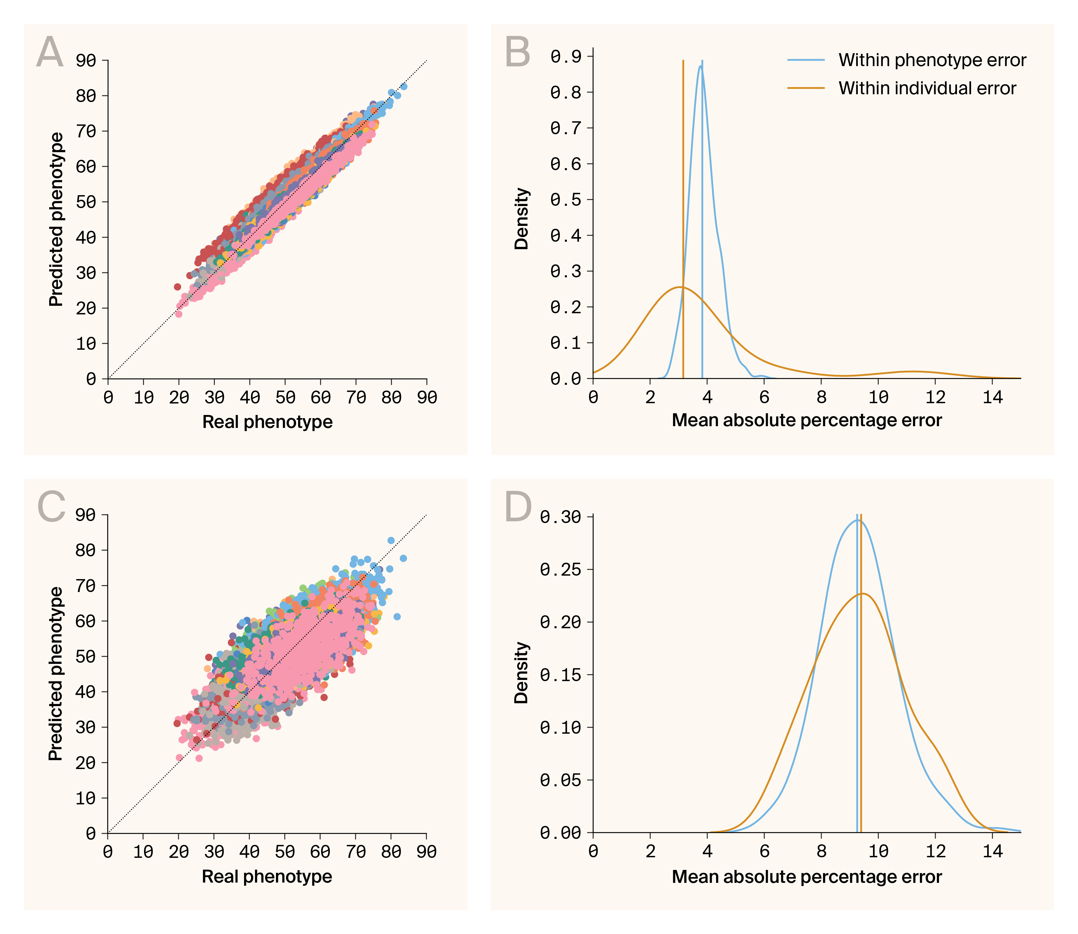
Phenotype–phenotype and genotype–phenotype predictions are accurate.
(A) Comparison of predicted and real phenotypes generated by the phenotype–phenotype autoencoder. Data points are individual/phenotype pairs. The color indicates phenotype. Plotted are predictions for 30 phenotypes.
(B) Densities for errors from phenotype–phenotype prediction aggregated across phenotypes (blue) and individuals (orange).
(C) Comparison of predicted and real phenotypes generated by genotype–phenotype mapping. Data points are individual/phenotype pairs. The color indicates phenotype. Plotted are predictions for 30 phenotypes.
(D) Densities for errors from genotype–phenotype prediction aggregated across phenotypes (blue) and individuals (orange).
An organism’s phenotypes are interconnected to varying degrees through shared genetic architecture, developmental pathways, and physical constraints. Holistic models of biological systems must be able to account for the complexity of phenotype–phenotype relationships. We assessed the predictive capability of G–P Atlas by examining the accuracy of phenotype–phenotype prediction on the unperturbed test data. This autoencoder provided an accurate prediction of our test data (Figure 2, A), producing low prediction errors (mean absolute percentage error, MAPE) for phenotypes and individuals (Figure 2, B; median MAPE per phenotype = 3.78, blue line; median MAPE per individual = 3.54, orange line). Thus, this autoencoder learns a generalizable encoding of phenotypes robust to noise. The complete model can predict phenotypes of new samples, and we'll leverage this lower-dimensional encoding space for genotype–phenotype mapping.
Having established G–P Atlas's ability to model phenotype–phenotype relationships, we next evaluated its ability to predict phenotypes from genotypic data, a fundamental challenge in genetics. We trained a model that predicted phenotypes from genotypes. We connected the input of the pre-trained phenotype decoder (Figure 1, B; blue) to the output of an untrained genotype encoder (Figure 1, B; orange). We then conducted a second round of training, holding decoder weights constant. The training goal was to predict phenotypes from genotypes. We corrupted the genotypic inputs by randomly changing 80% of allelic states. While less accurate than the phenotype–phenotype model, this genotype–phenotype mapping provided accurate predictions for our test data (Figure 2, C), both for phenotypes (Figure 2, D; median MAPE per phenotype = 9.11, blue line) and individuals (Figure 2, D; median MAPE per individual = 9.02, orange line). The model, therefore, learns an accurate, robust, and generalizable mapping between genotypes and phenotypes. This enables the prediction of many phenotypes directly from genetic data and suggests the potential to capture both linear and nonlinear relationships in more complex biological datasets.
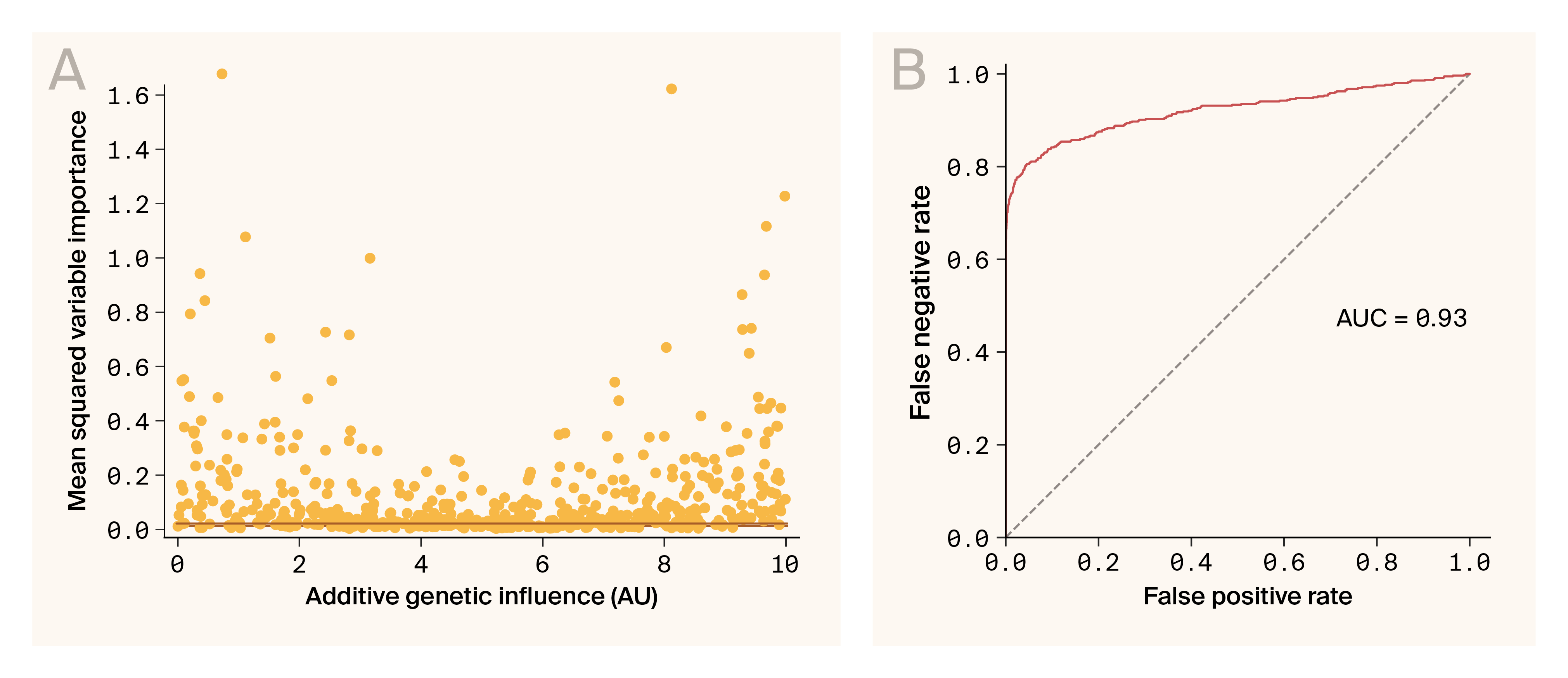
Ablation variable importance can be used to identify genes influencing phenotypes.
(A) The mean squared variable importance for each locus known to influence any one phenotype is plotted against the known additive genetic influence of that same locus. The orange line indicates the 1% false positive threshold.
(B) The Receiver Operator Characteristic curve demonstrates that variable importance is an effective classifier for loci influencing a phenotype through the relationship between false positive rates and false negative rates for differing mean squared variable importance thresholds. AUC indicates the area under the curve.
A central goal of genetic models (including G–P Atlas) is the identification of genotypes that influence phenotypes. We determined the phenotypic influence (variable importance) of a locus by measuring the change in the predicted phenotype distribution when a locus was omitted. If this measure only captures additive genetic influences of a locus, we might expect variable importance to be correlated with the known additive contribution of a locus. However, we found no clear correlation (Figure 3, A). This lack of correlation could be related to the non-additive effects of these loci. Nevertheless, using this statistic, we can identify most loci that influence phenotypes (Figure 3). A threshold of 1% false positive identified 96.8% (179/185) of influential loci (Figure 3, A), and a receiver–operator analysis had an area under the curve of 0.93 (Figure 3, B), consistent with the accurate classification of alleles influencing phenotypes.
While the G–P Atlas architecture could capture gene–gene interactions, we wanted to investigate if it uses interactions for its phenotype predictions. We therefore asked two questions. First, knowing which loci are involved in interactions, can we determine whether these loci influence the predicted phenotypes differently than loci that act only directly? Second, can we develop a statistic that would allow us to enrich for loci involved in gene–gene interactions so that we can prioritize loci for further network analysis? To address both questions, we focused on the variable importance metric described above because it directly quantifies how strongly a given locus influences phenotypic predictions.
When examining the variable importance estimate for each individual at each locus, we found that the distribution of measures is significantly more kurtotic (heavy-tailed) than the distribution for loci that aren't involved in interactions as indicated by significant deviation from the unity line in the upper and lower quantiles in a Q–Q plot (Figure 4, A, Q–Q plot; B, bootstrap kurtosis test, p < 0.001). This shows that, for some individuals, loci that can act through interactions cause larger changes in the phenotype distribution than loci that can’t act through interactions. This is consistent with the expected impact of gene–gene interactions in our simulated dataset, where the interaction effects are multiplicative and likely to drive extreme phenotypes.
Alleles involved in interactions can have extreme variable importance measures in some individuals. Given this, we developed a per-allelic state statistic, variable importance distribution analysis (VIDA), to indicate whether an allelic state at a specific locus is involved in an interaction. VIDA captures two intuitions. First, interacting alleles should share patterns of extreme variable importance across individuals. Second, interacting alleles should have similarly extreme variable importance values. The average VIDA score for interacting alleles was significantly higher than that of non-interacting alleles (median 0.00205 interacting vs. median −0.000503 non-interacting, p < 0.001, Mann–Whitney U). This is consistent with the idea that the statistic measures interaction involvement. However, VIDA proved to be only modestly useful for the classification of alleles as interacting or non-interacting (Figure 5, A; ROC AUC 0.64, sensitivity of 0.528, specificity of 0.718). Nevertheless, VIDA can provide significant enrichment of interacting loci in the upper percentiles of the score (Figure 5, B; hyper-geometric test, enrichment by percentile of VIDA score: 1.4× ± 0.93–1.70 in top 10%, 1.35× ± 1.13–1.54 in top 20%, p < 0.001 for both, ± = 95% confidence interval) indicating that it could be helpful in prioritizing loci with higher chances of involvement in interactions for subsequent experimentation. Overall, the ability to enrich alleles involved in interactions based on these variable importance scores suggests that, to some degree, G–P Atlas is leveraging gene–gene interactions for phenotypic prediction.
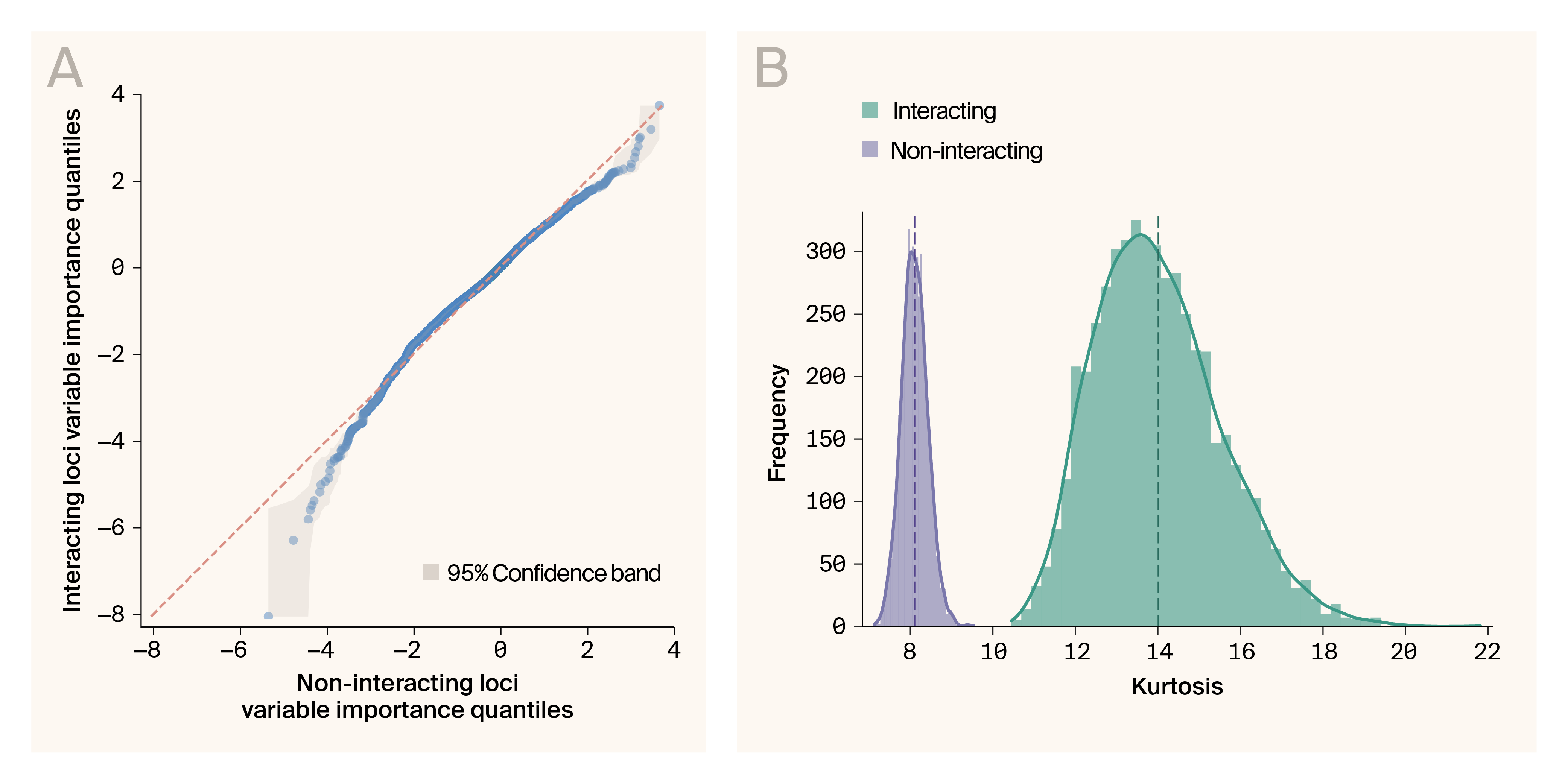
Variable importance values are more extreme for interacting loci than for non-interacting loci.
(A) Quantile–quantile plot of variable importance measure compared between loci that act through gene–gene interactions and those that don’t. The orange line indicates equivalency between distributions. Grey indicates 95% confidence interval.
(B) Kurtosis for bootstrapped samples from variable importance measures of interacting (blue) and non-interacting (red) loci. Dashed lines indicate mean values. Solid lines are kernel density estimates.
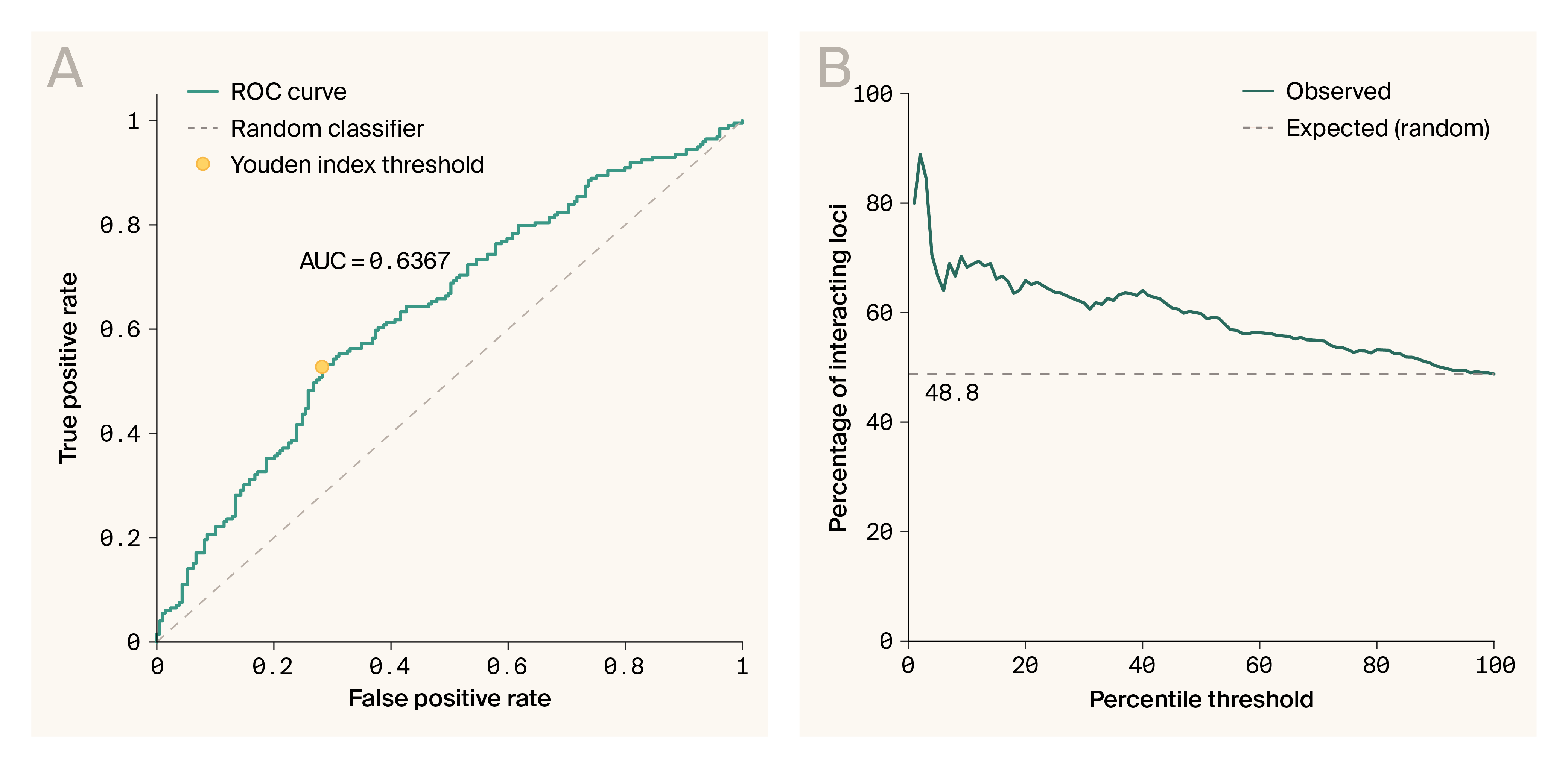
G–P Atlas can be used to enrich for alleles involved in gene–gene interactions.
(A) Receiver operator curve for VIDA statistic and whether alleles are involved in interactions or not. The orange line indicates random. Red circle indicates optimal (Youden’s index) ROC value with sensitivity of 0.528, and specificity of 0.718.
(B) Enrichment of interacting loci as a function of percentile threshold in VIDA scores. The dashed line indicates no enrichment.
Our simulated data analysis confirms that G–P Atlas can successfully learn meaningful phenotype representations, predict multiple traits simultaneously from genetic and phenotypic data, and identify causal genetic variants with high sensitivity and specificity. Furthermore, it uses gene–gene interactions to make these predictions. This proof-of-concept validation establishes a foundation for applying G–P Atlas to experimental biological data, where we can assess whether its unique capabilities translate to significant improvements over conventional genetic analysis methods in capturing the full spectrum of genetic influences on complex traits.
Architecture application: Yeast cross data
Next, we applied G–P Atlas to real biological data. We analyzed an extensively studied population from a cross between two yeast strains (Saccharomyces cerevisiae) [39]. While we don't know the true relationships between genes and phenotypes in this population, other researchers have conducted many genetic analyses mapping genes to phenotypes, providing a benchmark to evaluate the performance of G–P Atlas relative to conventional approaches.
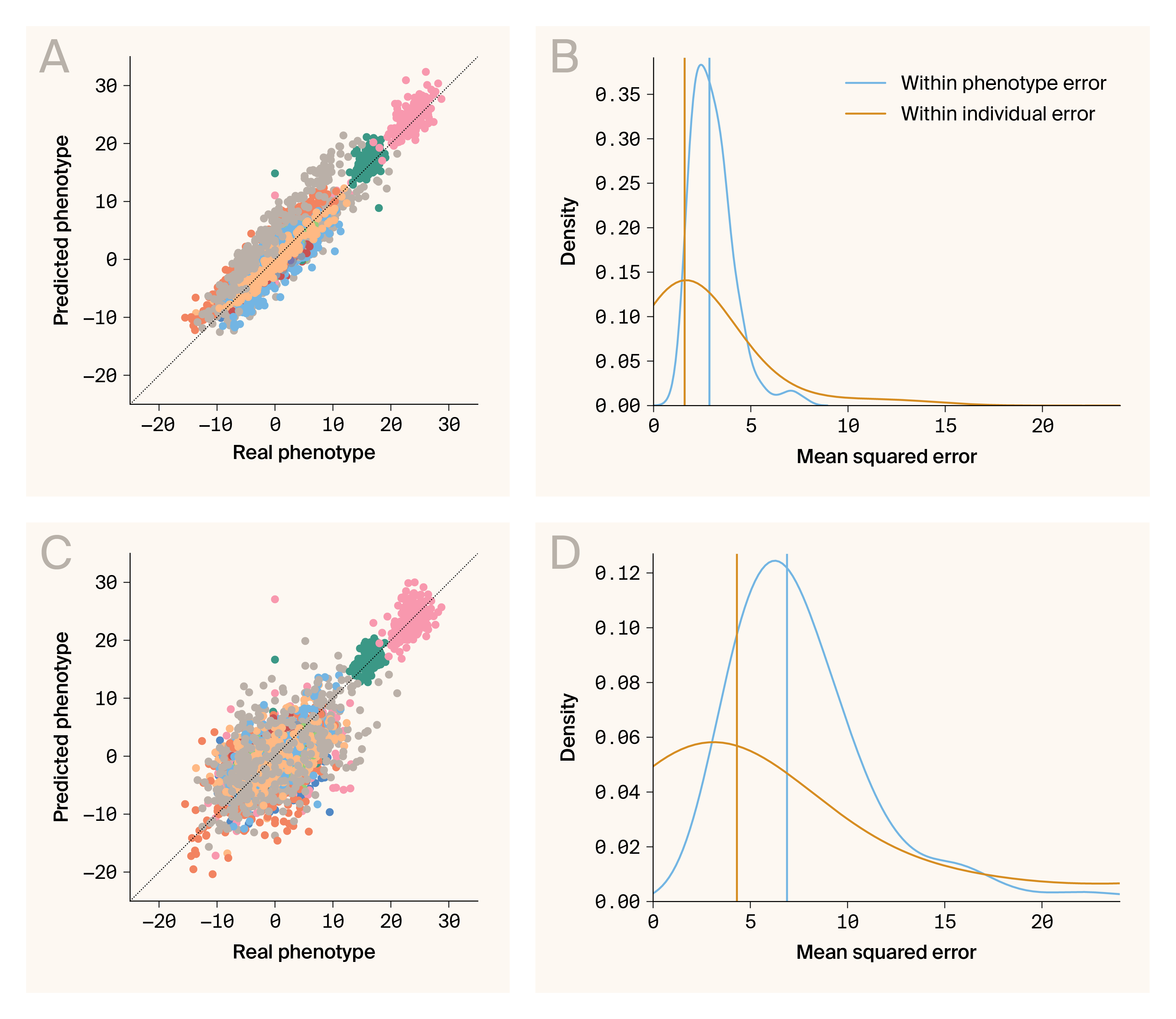
Phenotype–phenotype and genotype–phenotype predictions are accurate for a hybrid yeast population.
(A) Comparison of predicted and real phenotypes generated by the phenotype–phenotype autoencoder. Data points are individual/phenotype pairs. The color indicates phenotype. Plotted are predictions for 46 phenotypes.
(B) Densities for errors from phenotype–phenotype prediction aggregated across phenotypes (blue) and individuals (orange).
(C) Comparison of predicted and real phenotypes generated by genotype–phenotype mapping. Data points are individual/phenotype pairs. The color indicates phenotype. Plotted are predictions for 46 phenotypes.
(D) Densities for errors from genotype–phenotype prediction aggregated across phenotypes (blue) and individuals (orange).
Empirical data presents additional complexity compared to simulations. It's complicated by measurement noise, environmental variation, and unobserved factors that can obscure phenotype–phenotype relationships. Despite these challenges, G–P Atlas accurately predicts phenotypes from phenotypes in biological data (Figure 6, A–B), yielding low prediction errors (mean squared error, MSE) when aggregated across phenotypes or individuals (Figure 6, B; median MSE per phenotype of 2.87, blue line; median MSE per individual of 1.60, orange line). This robust performance in predicting phenotypes from other phenotypes demonstrates that G–P Atlas effectively captures the underlying constraints linking multiple traits, reflecting phenomena such as pleiotropy, physical constraints, and shared developmental pathways that create relationships between seemingly distinct traits.
Next, we evaluated the primary function of G–P Atlas: predicting phenotypes directly from genotypic data. As with simulated data, the model accurately predicts phenotypes from genotypes in this biological scenario (Figure 6, C–D), yielding low prediction errors when aggregated across phenotypes or individuals (Figure 6, D; median MSE per phenotype of 6.89, blue line; per individual of 4.31, orange line). G–P Atlas produces robust and somewhat accurate genotype–phenotype mapping, translating genetic information into comprehensive phenotypic predictions for multiple traits.
G–P Atlas does not account for as much phenotypic variation as traditional linear models
To evaluate the performance of G–P Atlas relative to the traditional explanatory models mentioned above, we compared the total fraction of phenotypic variation (coefficient of determination) captured by G–P Atlas to the fraction of phenotypic variation captured using a linear modeling approach. In particular, we compared it to a set of linear models, one for each phenotype, based on the additive contribution of significantly linked loci [39]. Similar models are frequently used in agriculture (genomic prediction, [43]) and medicine (disease risk prediction through polygenic risk scores, [44]).
As with G–P Atlas, this linear method relies on molecular-genetic information. It’s also two-tiered: for each phenotype, the model identifies loci linked to that phenotype through a quantitative trait linkage analysis and subsequently uses variation at the linked loci to infer phenotypes under that fitted model [39]. We found that, for all phenotypes, G–P Atlas explained significantly less phenotypic variation than the linear model (p < 0.001, Wilcoxon rank sum test). This suggests that, despite the fact that this model can be used to identify individual genes influencing phenotypes and can provide reasonably accurate phenotypic predictions, it isn't as data-efficient as a linear model with a dataset of this size.
G–P Atlas likely captures relationships among genes that influence phenotypes
To evaluate whether G–P Atlas captures nonlinear relationships among genes, we compared the performance of the full model to a version of the model that has a reduced ability to capture such relationships. The hidden layers in autoencoder allow the models to capture relationships among input parameters [29]. Without hidden layers, an autoencoder will result in a mostly linear transformation of the data [45][46]. Therefore, we used the same yeast dataset to train a different version of G–P Atlas without a hidden layer in the genotype encoder limiting the capture of gene–gene interactions. We then compared the explanatory power of this simplified model to that of the full G–P Atlas. We found that the full model explained significantly more variation than the reduced models (p < 0.002, Wilcoxon rank sum test), suggesting the full model captures meaningful interactions between genotypes and these interactions increase the prediction capacity.
G–P Atlas identifies individual genes driving phenotypic variation
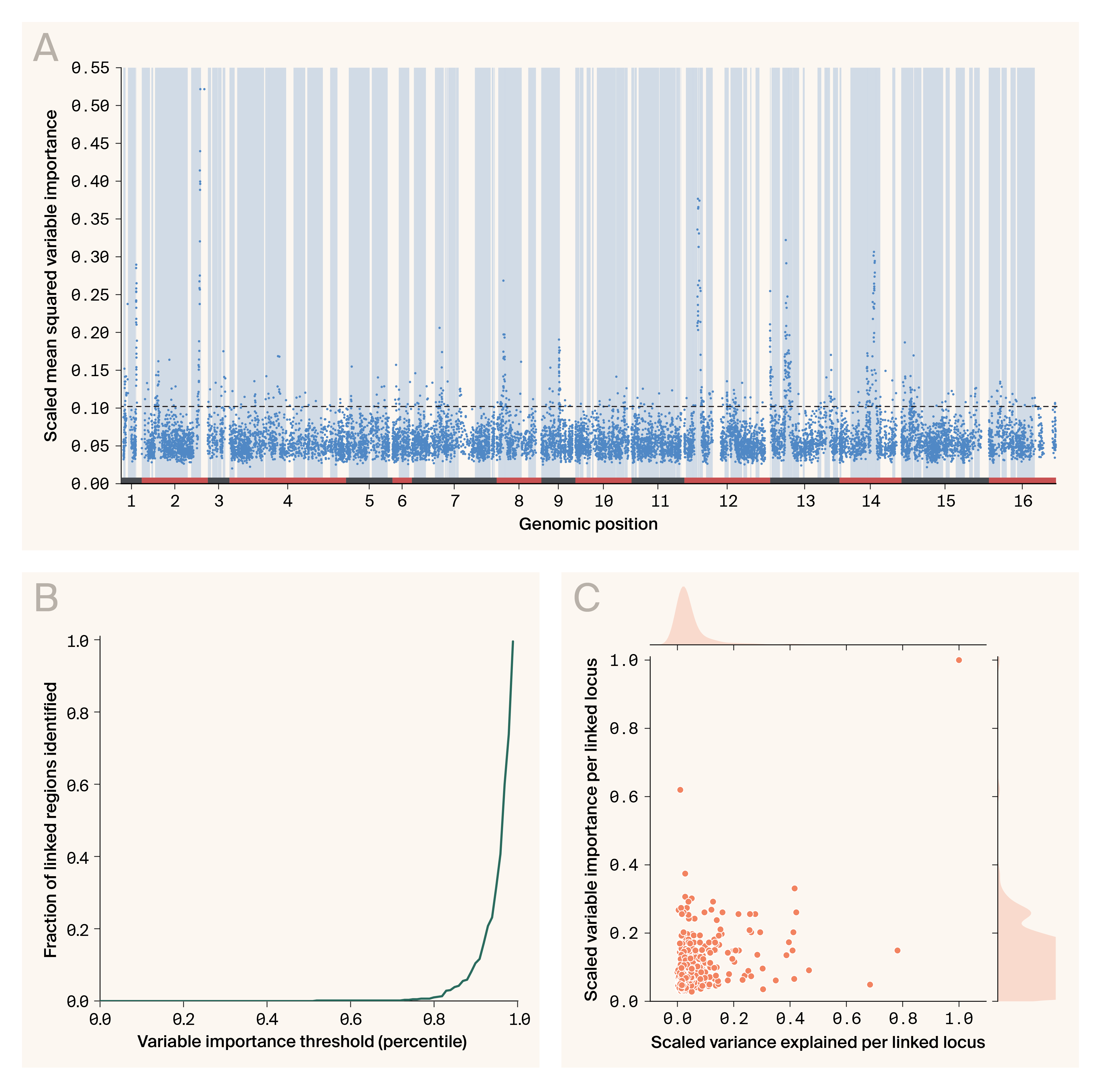
G–P Atlas identifies genes influencing phenotypes in a hybrid yeast population.
(A) Plotting of scaled squared variable importance per locus as a function of genomic position in nucleotides. Variable importance is calculated per allelic state. Each locus has two allelic states. The larger of the two variable importance values is shown. The colors and numbers at the bottom indicate chromosomes. The dotted line indicates the 95th percentile of variable importance values. Blue vertical bars indicate portions of the genome previously linked to phenotypic variation.
(B) A plot of the fraction of loci previously identified to be linked to a phenotype as a function of variable importance threshold.
(C) A plot of the additive phenotypic variance explained by each locus on the specific linked phenotype and the variable importance of that locus for the whole phenotype set.
Our analyses of this yeast data have thus far focused on the ability of G–P Atlas to predict or explain genetically driven variation in phenotypes holistically without focusing on any individual gene or phenotype. However, many genetic analyses aim to identify the particular genes that cause phenotypic variation. Thus, we next evaluated our ability to identify such genes using G–P Atlas and the ablation variable importance measure described above to find genes influencing phenotypes in these yeast data (Figure 7). This could allow us to identify genes acting solely through gene–gene interactions, which isn’t possible with current approaches.
Depicted in Figure 7, A is the importance of each locus in determining the distribution of all phenotypes plotted against the genomic position of that locus. This plot captures several promising anecdotal observations about the behavior of this statistic. First, the variable importance measure captures genetic linkage. That is, the variable importance of proximal markers is similar. This is consistent with a young population that hasn't gone through many generations and genetic recombination events, so proximal markers are still genetically linked. Second, most variable importance peaks fall within regions of the genome that have previously been linked to one of the measured phenotypes (depicted as blue vertical bars), suggesting variable importance may be helpful in identifying genes influencing these phenotypes. Third, we find variable importance peaks in genomic regions not previously linked to these phenotypes, suggesting our approach potentially identifies new loci influencing phenotypes, possibly through gene–gene interactions. Overall, these findings suggest that variable importance is a measure that's consistent with known biology and can identify new biology.
To more directly test the use of variable importance in identifying genes influencing phenotypes, we determined the cumulative fraction of loci previously identified to influence phenotypes above each percentile in the empirical distribution of importance values (Figure 7, B). We took this approach because, unlike the simulated data, we don’t know which loci influence phenotypes (true positives) and which loci don't influence phenotypes (true negatives). We only know which loci were previously linked to these phenotypes. The outcomes of these previous studies will have false negatives and positives compared to ground truth. We found that 93% (551/591) of all previously identified loci have measures in the top 90th percentile of variable importance, demonstrating that variable importance recapitulates previous genetic linkage analysis and is helpful in identifying genes influencing phenotypes.
Given that we can use variable importance to identify loci-influencing phenotypes, we were interested to see how this measure compares to the predicted additive influence of these loci on phenotypes (Figure 7, C). One possibility is that a given locus's variable importance and additive and independent contribution to a single phenotype are highly correlated. Such a result would be consistent with the idea that these loci influence individual phenotypes primarily through additive effects. Alternatively, these loci could act through nonlinear influences mediated by other loci and could contribute to more than one phenotype. G–P Atlas could capture such influences, but they wouldn't be present in the predicted additive genetic influence on one phenotype. While we find a significant correlation between variable importance and additive influence (Pearson's correlation of 0.47, p < 0.002), there are many loci with high variable importance and low additive influence and others with high additive influence and low variable importance, suggesting that these loci may have both additive and non-additive or non-independent effects, potentially on multiple phenotypes. The loci with high variable importance and low additive influence may be particularly interesting as they're potentially loci that are important for biology but weren't previously identified using conventional methods. Together, these results suggest that G–P Atlas and this approach to quantifying variable importance are exceptionally capable of identifying genes contributing to a set of phenotypes while agnostic to the mechanism by which they contribute.
Continuity of latent representations
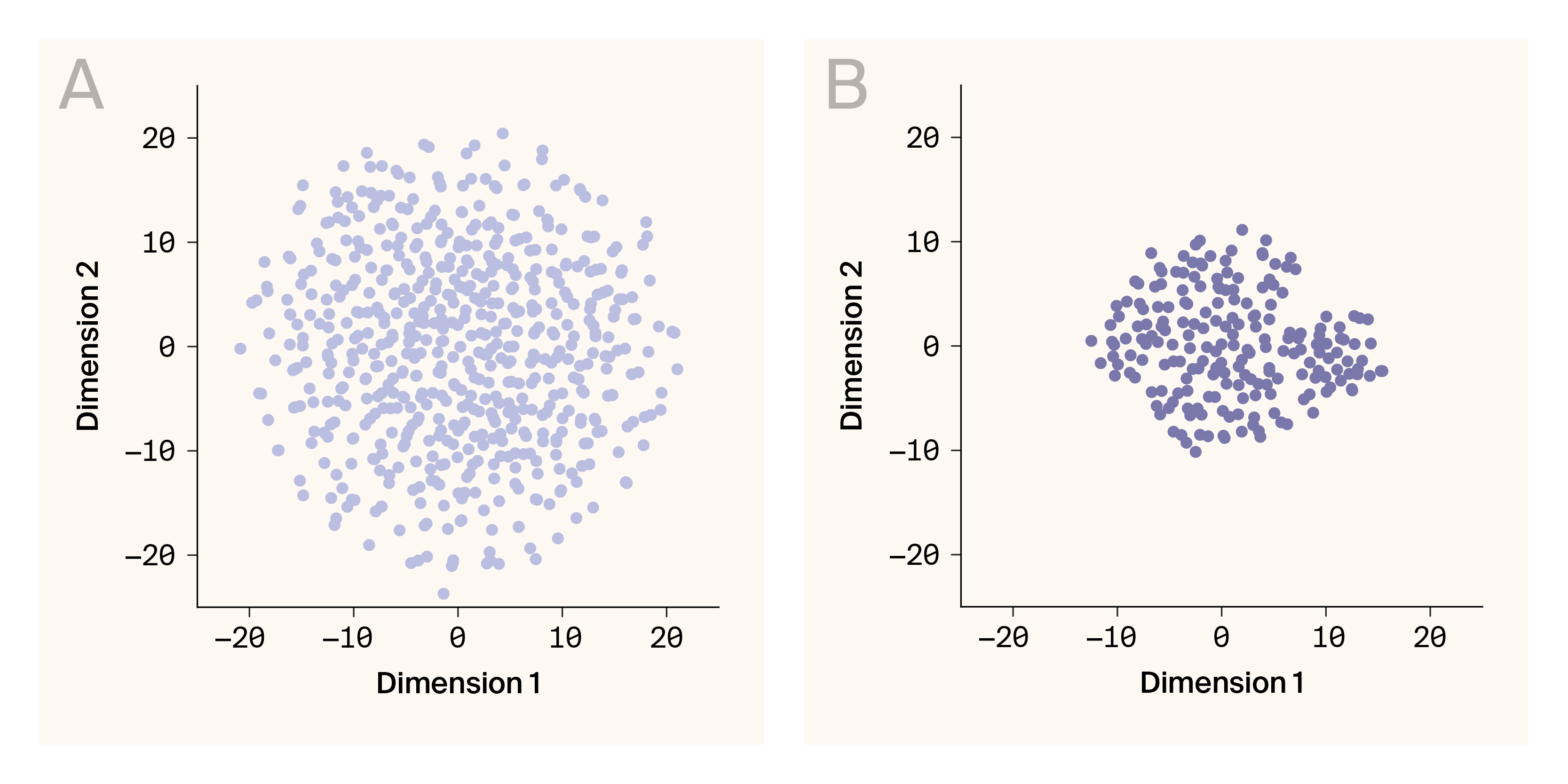
For both simulated and real phenotypes, the learned latent representations are reasonably continuous.
(A) Latent embeddings for simulated phenotypes.
(B) Latent embeddings for phenotypes from a yeast hybrid population.
Data points are individuals. 32-dimensional latent representations are projected into two-dimensional space using t-distributed stochastic neighboring embedding.
The continuity of latent representations learned by G–P Atlas has profound implications for both modeling and biological understanding. While standard autoencoders often produce discontinuous representations with significant gaps [47], our denoising approach naturally yields continuous latent spaces without requiring explicit constraints like those in variational autoencoders [26]. This emergent continuity reflects fundamental biological principles: phenotypic traits exist along continua shaped by genetic, developmental, and evolutionary constraints [48][49]. Such continuous representations enable not only more accurate interpolation between observed biological states but also potential generative applications, allowing simulation of novel phenotypes that respect biological constraints [50]. The continuity we observe in both simulated (Figure 8, A) and experimental yeast data (Figure 8, B) suggests that G–P Atlas captures the underlying manifold structure of biological variation, a property that could prove invaluable for predicting phenotypic outcomes of genetic interventions or evolutionary trajectories [51].
Key takeaways
For nearly a century, genetic mapping has relied on analyzing individual traits and assuming simple additive relationships between genes and phenotypes. G–P Atlas fundamentally reimagines this approach by modeling an organism's genetic architecture more holistically. Our neural network framework captures what biologists have long understood — that genes interact with each other in complex ways and phenotypes are interconnected through shared biological processes.
The advantages of G–P Atlas are substantial and practical. G–P Atlas identifies genes influencing phenotypes that conventional methods may not find, particularly those acting through gene–gene interactions. In different contexts, these newly identified genetic influences represent potential therapeutic targets, breeding markers, or handles for mechanistically studying new biology.
G–P Atlas offers a path toward more realistic modeling of entire living systems by modeling many phenotypes simultaneously. It brings us closer to a comprehensive, predictive understanding of how genotypes give rise to phenotypes.
The transition from reductionist to holistic modeling of genetic architecture represents a shift in how we capture biological complexity. As we release our framework and code openly to the scientific community, we encourage researchers to apply and build upon G–P Atlas in their own studies of complex traits. We hope you’ll develop even more comprehensive frameworks that further bridge the gap between genotype and phenotype.
Additional methods
We used Claude to suggest wording ideas and then choose which small phrases or sentence structure ideas to use, to help clarify and streamline text that we wrote, to produce draft text that we later edited, to help write code, and to clean up code. We used ChatGPT and GitHub Copilot to clean up code.
Next steps
Biological framework improvements
While this modeling framework captures known biological phenomena not typically leveraged by other approaches, several obvious extensions would capture even more biology.
For example, in this framework, we treat all alleles independently, even though we know that alleles in the same nucleotide position are mutually exclusive and thus contain significant information about each other. We could incorporate this information with an initial layer that convolves alleles at the same nucleotide position. Additionally, we don't incorporate information like genetic linkage among loci, which is often known. Within a population, there will be linkage among loci that are physically proximal to one another. As a result, linked loci contain information about each other. It would be possible to more efficiently encode genetic information by convolving an individual locus with data from genetically proximal loci. We could incorporate linkage by instantiating an initial graph convolutional layer representing genetic markers wherein edge weights are proportional to the genetic distance between markers, allowing convolution among loci based on their genetic distance.
Furthermore, we’ve not yet attempted to capture or control for genetic population structure. So far, we’ve tested this framework on simulated data with no historical population structure and a yeast population that's the first generation of a single cross (haploid; first filial, F1; population). However, many populations (e.g., humans) have long breeding histories that cause non-independent allele frequencies due to factors such as country of origin. It's common to account for these relationships in linkage studies or to leverage them to identify populations. In our framework, we could use a second autoencoder that compresses the genetic data into a lower-dimensional space, as we did here for phenotypes. Indeed, other researchers have already used a similar approach to identify population classes for individuals [22].
Machine learning improvements
The artificial neural network architecture we use here is relatively simple compared to many recent advancements in the field, including diffusion and modern attention mechanisms. Employing some of these new approaches will likely improve the accuracy or data efficiency of G–P Atlas. In particular, to provide data efficiency, we limit the bandwidth of the mapping between genetic data and the phenotypic latent space. An alternative approach that's become increasingly common is to use a sparse autoencoder [32]. These are structured similarly to conventional autoencoders, but a reduced bandwidth limit in the latent representation and the information bottleneck is imposed through a penalty on complexity during training. Such an approach could help capture even more relationships among genetic loci.
Expanded application
Beyond these improvements, we hope to apply this general approach to many more datasets and adapt the framework appropriately. For example, all the data presented here are continuous phenotypes, but many phenotypes of interest (e.g., diagnosed disease state) are categorical. We aim to extend the framework to enable continuous and categorical phenotype analysis simultaneously. Furthermore, we'd like to add the ability to input environmental measurements (both continuous and categorical) at the genotype-to-phenotype mapping step. Such expansions would allow ready application to large datasets of human genetic information.
Identifying interactions
While we’ve demonstrated that G–P Atlas can capture non-additive genetic influences on phenotypes and we can use variable importance to identify which loci impact phenotypes, we didn’t explore our ability to identify gene–gene, gene–environment, or allele–allele interactions. We'll investigate this possibility in forthcoming work.
Generative modeling of whole organisms
At the limit, a model that captures the mapping between all drivers of organismal variation (i.e., genotype and environment) to all phenotypes that vary in a population should produce a generative model capable of creating novel organisms consistent with those from the modeled group. This approach is common in modern deep neural networks for generating language or images based on a prompt [25][52]. Furthermore, as with models for images and language, interrogation of the structure of that generative model may provide insight into the shared biological processes that create an organism [53][54]. G–P Atlas represents a first step toward a comprehensive generative model for an organism.
References
Share your thoughts!
Feel free to provide feedback by commenting in the box at the bottom of this page or by posting about this work on social media. Please make all feedback public so other readers can benefit from the discussion.
